The brand explores a bold feminine identity through tension: androgynous forms paired with sheer textures, sharp attitude balanced by softness, provocation wrapped in elegance.
The brand explores a bold feminine identity through tension: androgynous forms paired with sheer textures, sharp attitude balanced by softness, provocation wrapped in elegance.
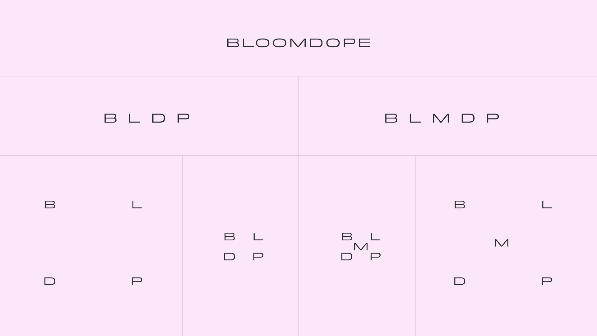
I built a custom logo mark from the letters "b" and "d", merging floral softness with sharp, subcultural energy. A modular logo system allows the brand to shift between a minimal wordmark and deconstructed letter arrangements. I also developed a distinctive ornamental pattern derived from the mark, bringing movement, sensuality, and consistency across packaging, tags, and digital touchpoints.